RMTE AI
Intelligence that works beyond the signal.
Critical work happens where the network does not reach. We build AI that runs entirely on the device already in your pocket.
01 / The problem
Modern AI stops at the edge of the network.
Not an edge case. Entire industries operate past it, every day. Pick one.
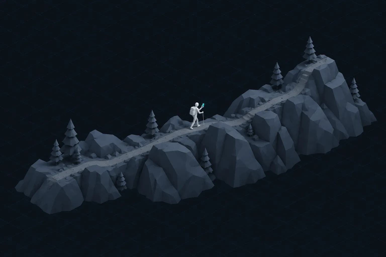
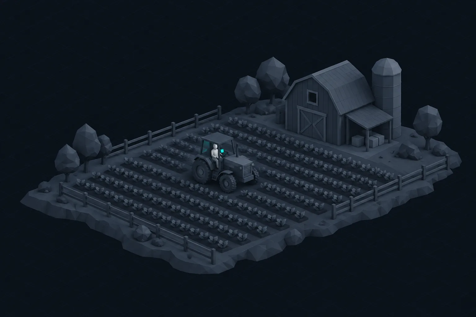
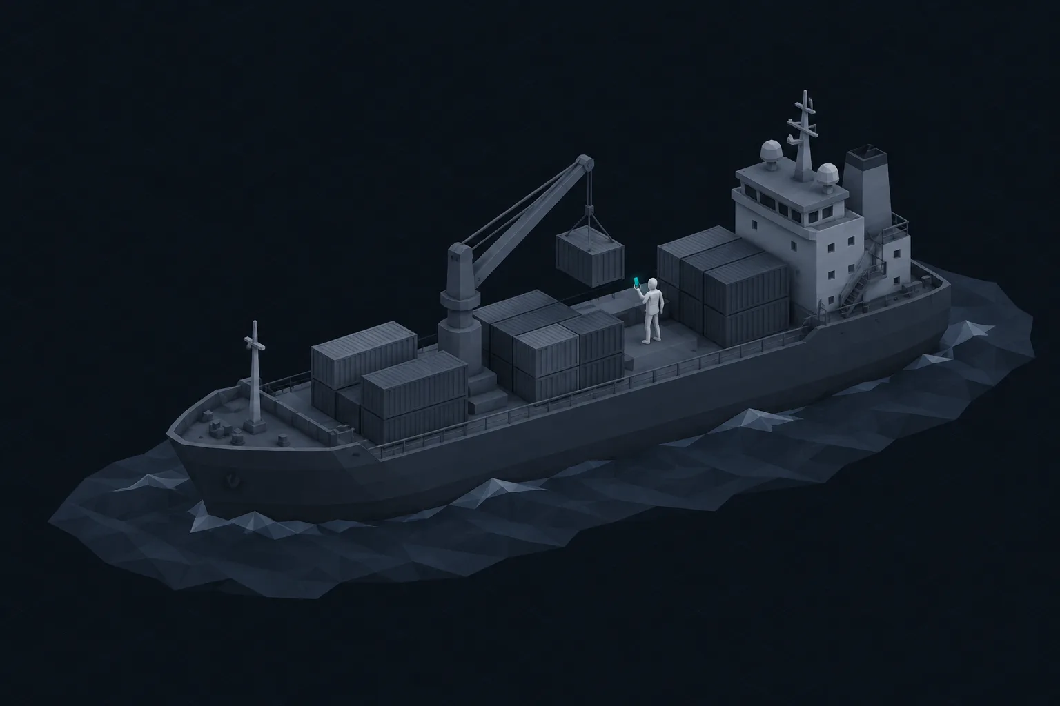
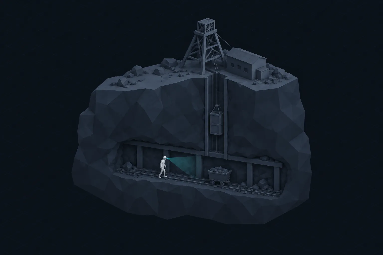
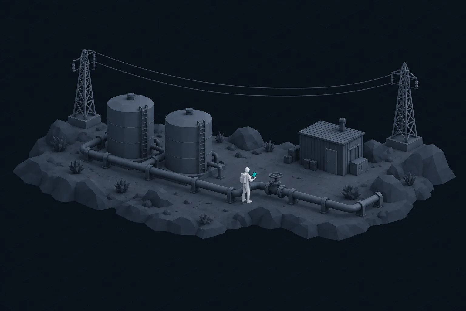
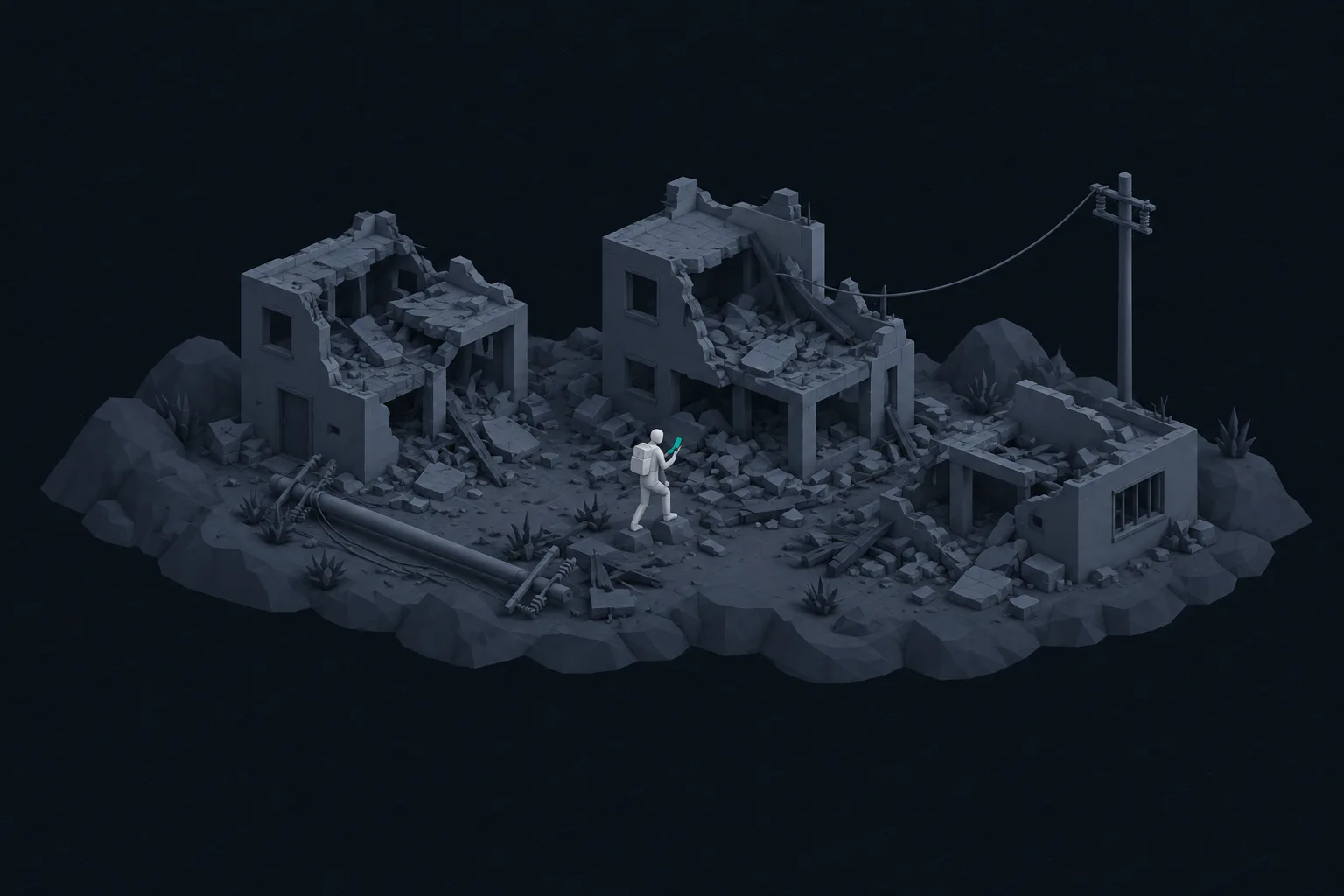
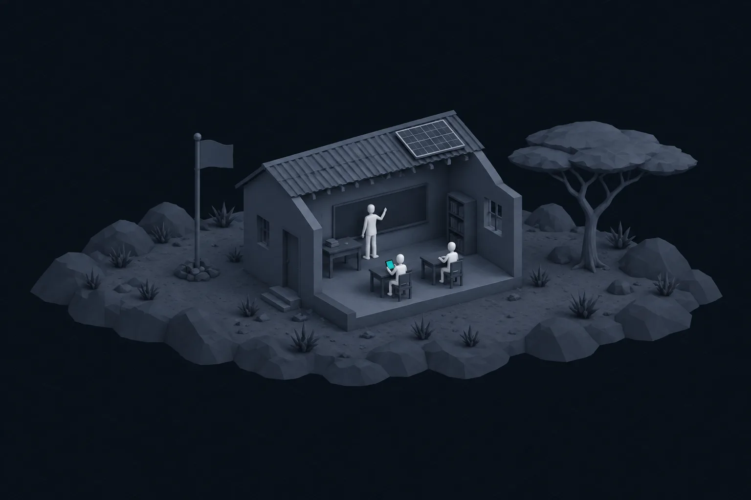
Network
Edge of coverage
- Typical signal
- None
- Time out of range
- Days
- Decisions at stake
- Weather, wildlife, first-aid judgement calls
02 / The opportunity
Make the intelligence portable.
Not a shrunken chatbot. Intelligence built for disconnected places, and carried there in advance.
Cloud AI
On-device AI
Needs a connection
Cloud AI
On-device AI
Where the model runs
Cloud AI
On-device AI
Every question
Cloud AI
On-device AI
Your data
Cloud AI
On-device AI
With no service
Cloud AI
On-device AI
Limited by
Cloud AI
On-device AI
No signal required. Private by default. Available when the cloud isn’t.
03 / What we are building
Three parts, shipped as one app.
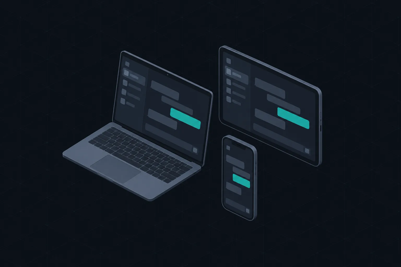
The model and the knowledge it needs both live inside the app, and the app lives on the device.
Apps
Purpose-built offline experiences on the web, on phones and on tablets, for people who need answers beyond reliable connectivity. First-class software, not a science demo.
Models
Lightweight models for text and images, built by experts. Designed to find information and summarize it clearly, rather than memorize everything.
Knowledge packs
Downloadable, vector-indexed knowledge for a specific place or job. Take the information you need with you.
04 / Back in range
The connection is an upgrade, not a requirement.
We are not trying to out-argue the frontier labs. When you are back on the network, we use it.
Questions asked and answered on the device. Anything the pack could not cover is held, not lost.
The app notices, and picks up the work it set aside. Nothing for you to do.
- Field conversations saved
- Held questions answered in full
- Models and packs updated for next time
05 / First product
Silas
An assistant for the backcountry that works with no signal. We start where the problem is easiest to see and hardest to fake: a phone, a trail, and no service. Everything we learn there is the same system every other industry needs.
Two roles, always labeled
For weather, wildlife, plants and first aid, Silas answers from reviewed knowledge packs and shows its source. For everything else, from why there are 365 days in a year to a story for the campfire, it answers from its own knowledge and says so.
- What should I look for in these approaching clouds?
- How do I start a fire when the wood is damp?
- What kind of wildlife lives in this area?
- How do I treat a rolled ankle two days from a road?
The world does not stop when the signal disappears. Neither should your AI.
Waitlist
Be there when the signal drops.
Early access and occasional notes on what we are building. No noise.